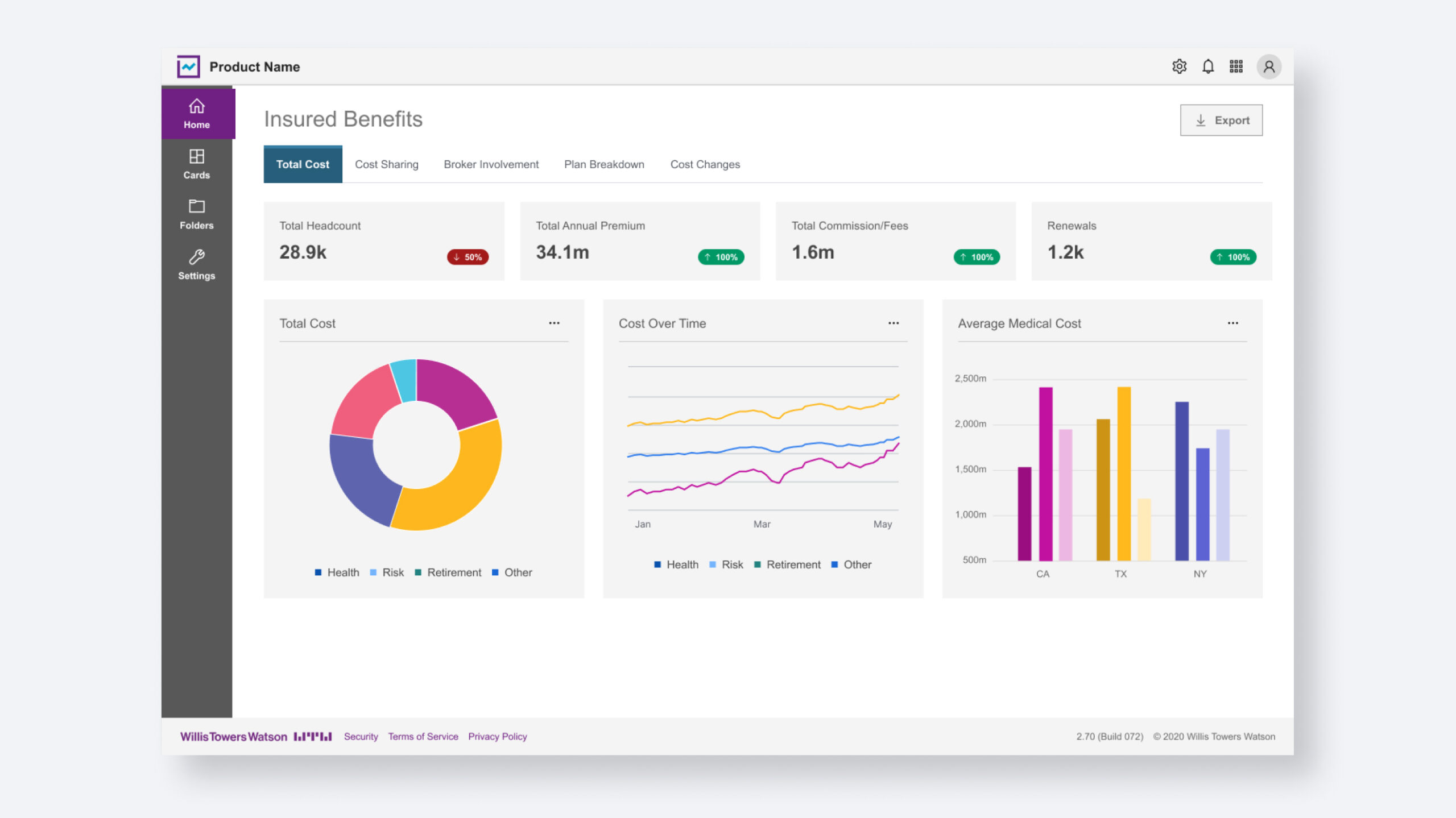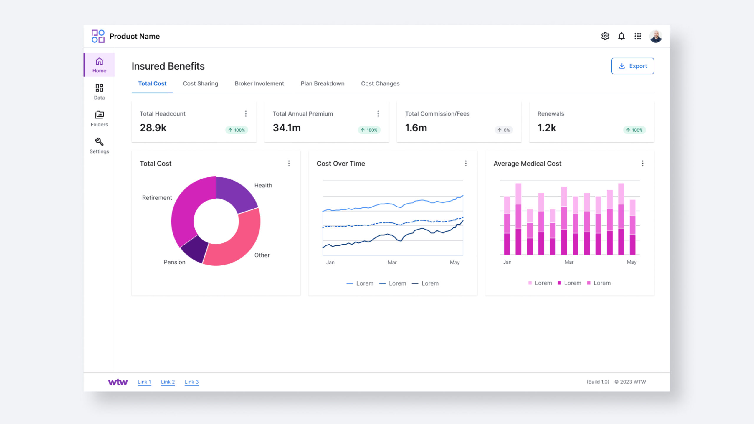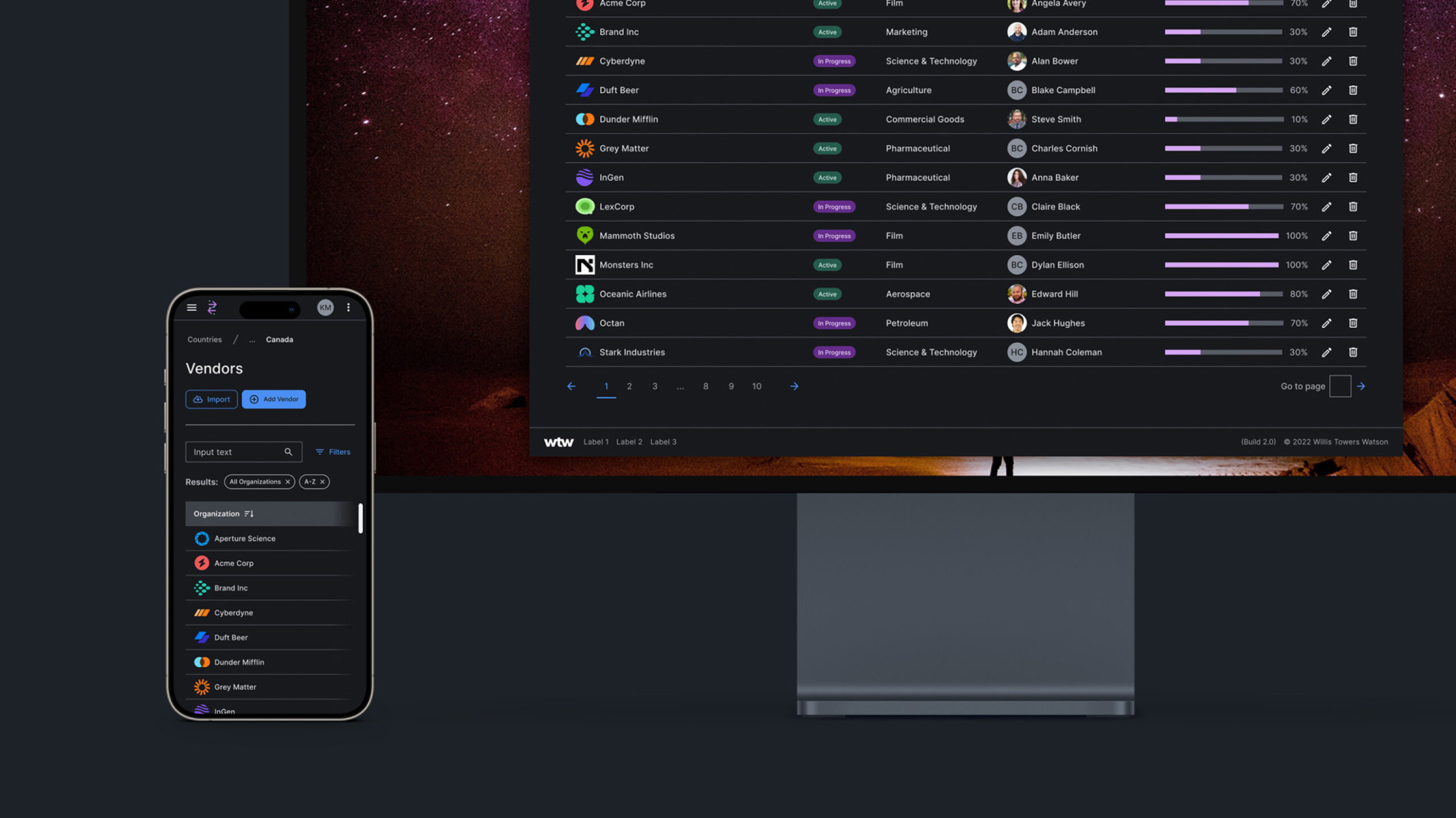
Following the success of the WTW Digital Design System, the client entrusted my team with another, more expansive design system. This system would be more comprehensive, including code and light to dark mode, intended for utilization among WTW design and development teams.
As this product is powered by WTW and serves a functional purpose rather than acting as a marketing tool, it was crucial to strike a balance between maintaining the brand presence and ensuring the usability of the software.
We initiated stakeholder interviews and leveraged the WTW Digital Design System as a foundation. Our focus was on integrating user needs while adhering to existing system guidelines, thereby establishing consistency across all WTW digital asset structures.
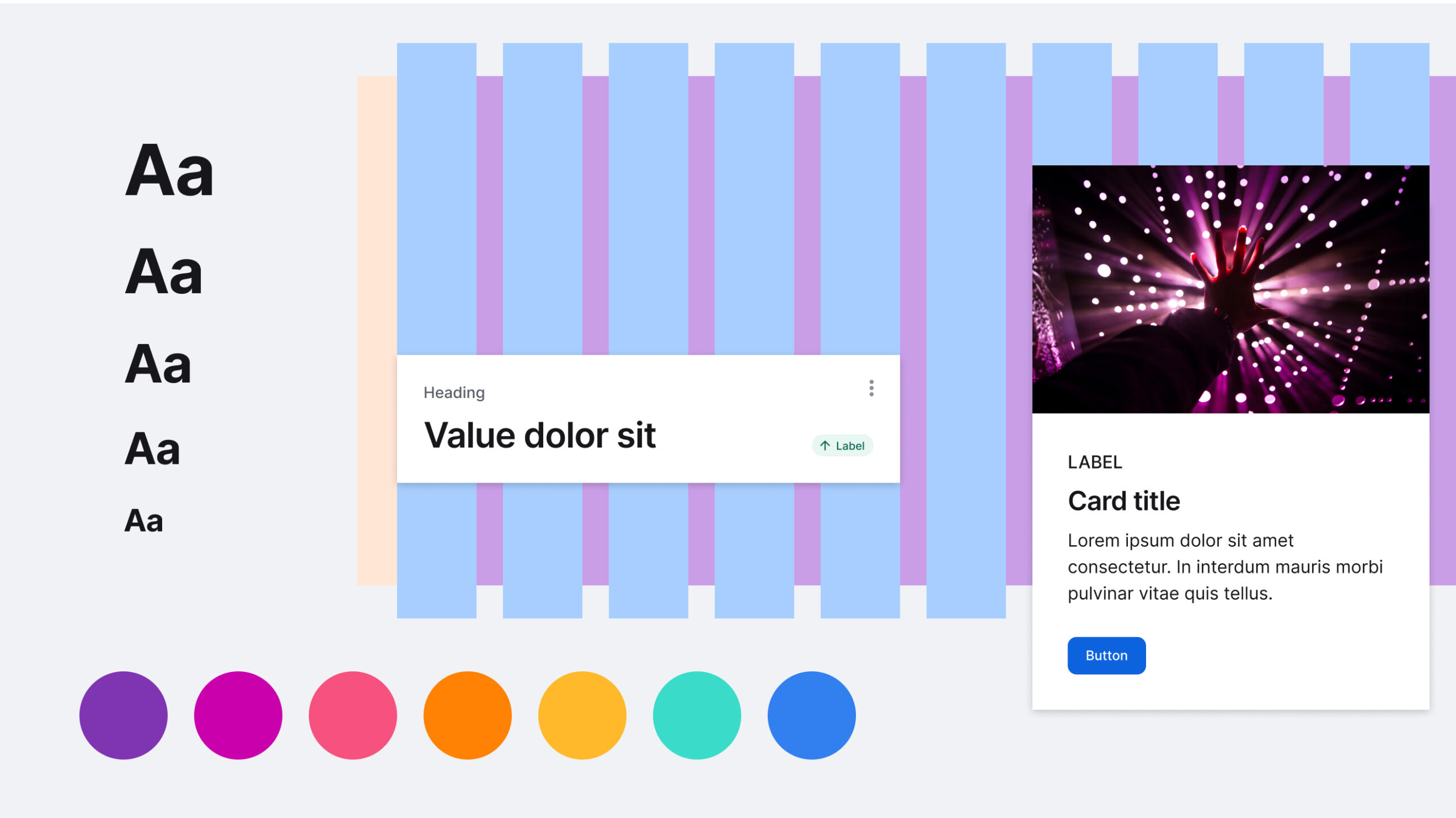
While WTW's color system was expansive, we exercised thoughtfulness in its application from a non-marketing perspective. We further refined it by introducing semantic colors that complemented the brand palette, along with neutrals that harmonized specifically with the Stratosphere Blue call-to-action elements.
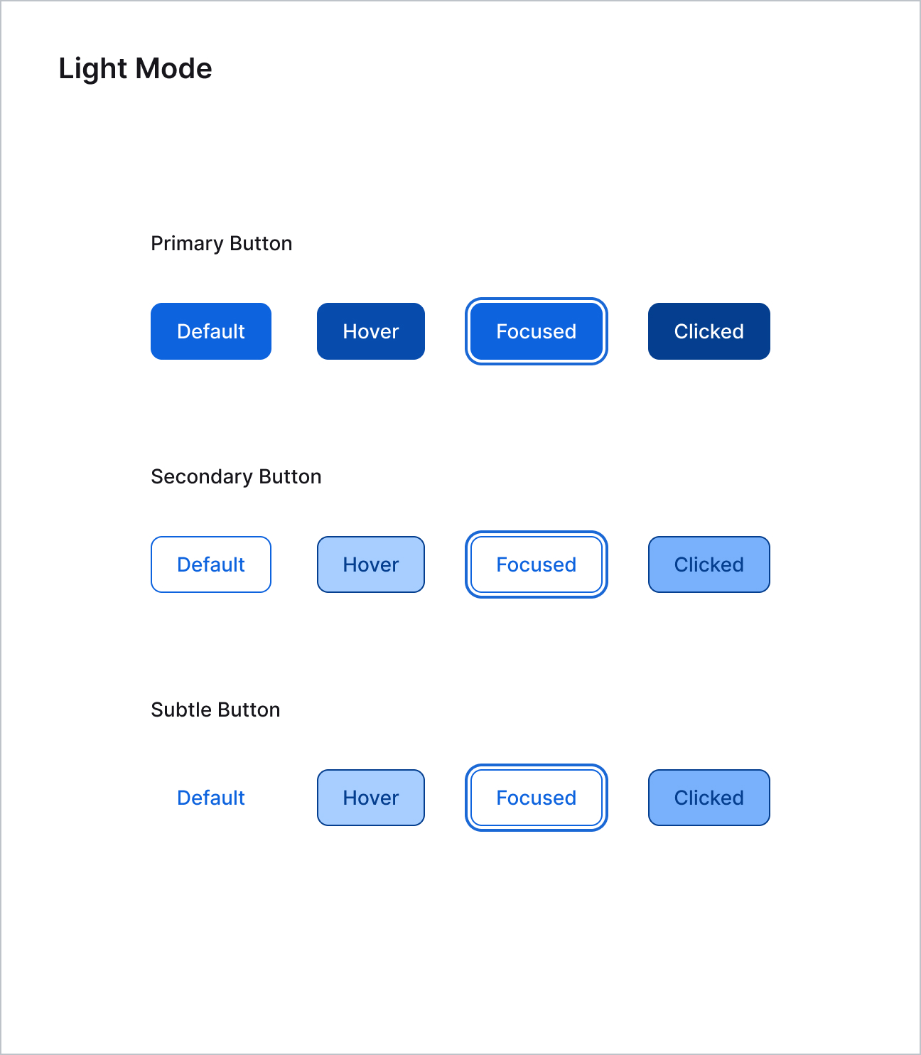
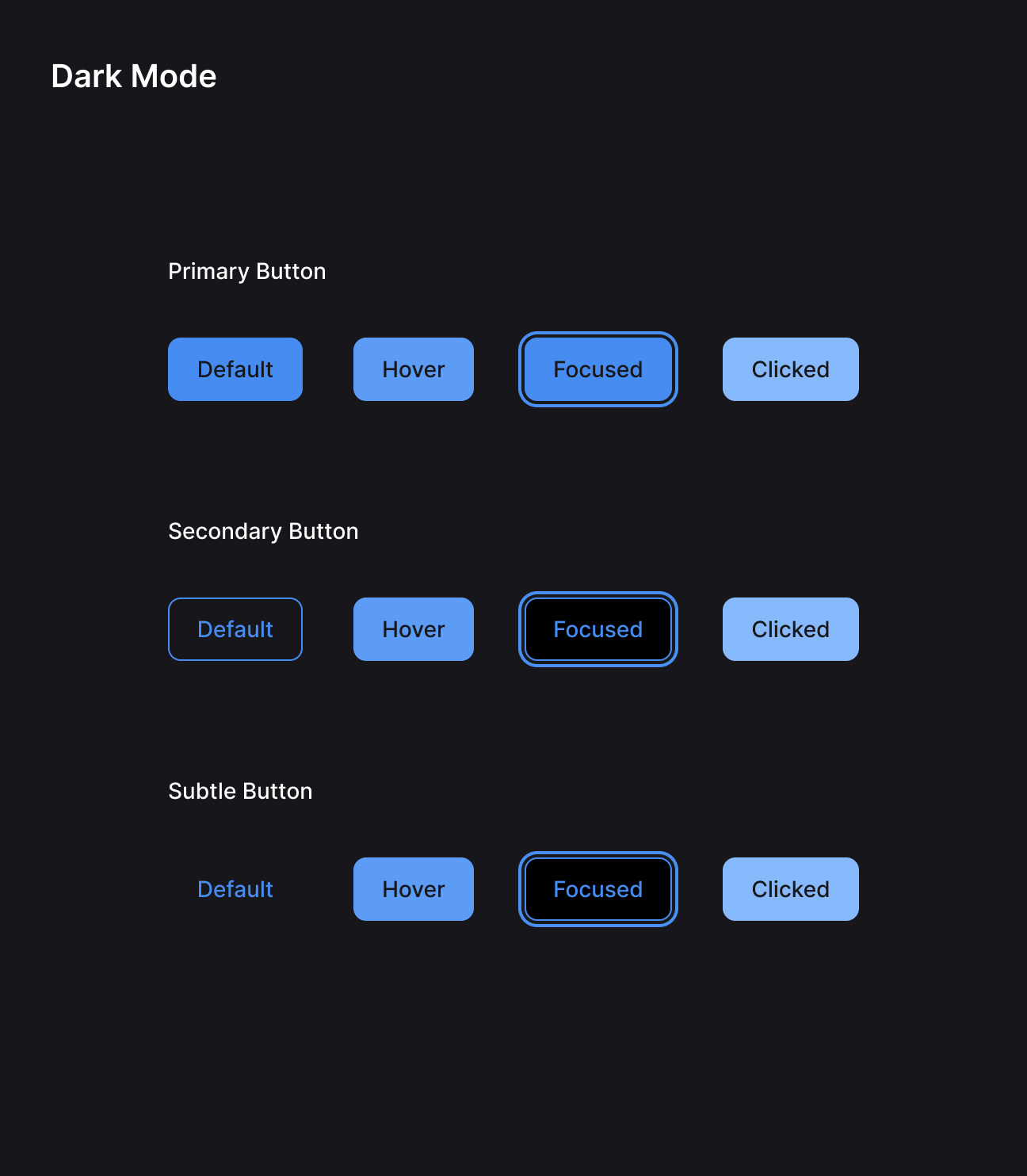
The system also incorporated guidelines for both light and dark modes. Acknowledging the growing importance of accommodating user viewing preferences, we designed a solution that catered to development needs, avoiding the creation of an entirely new dark mode palette.
Director
Design System with component library, tokens, and HTML/CSS, Light and Dark Mode, System Application Examples
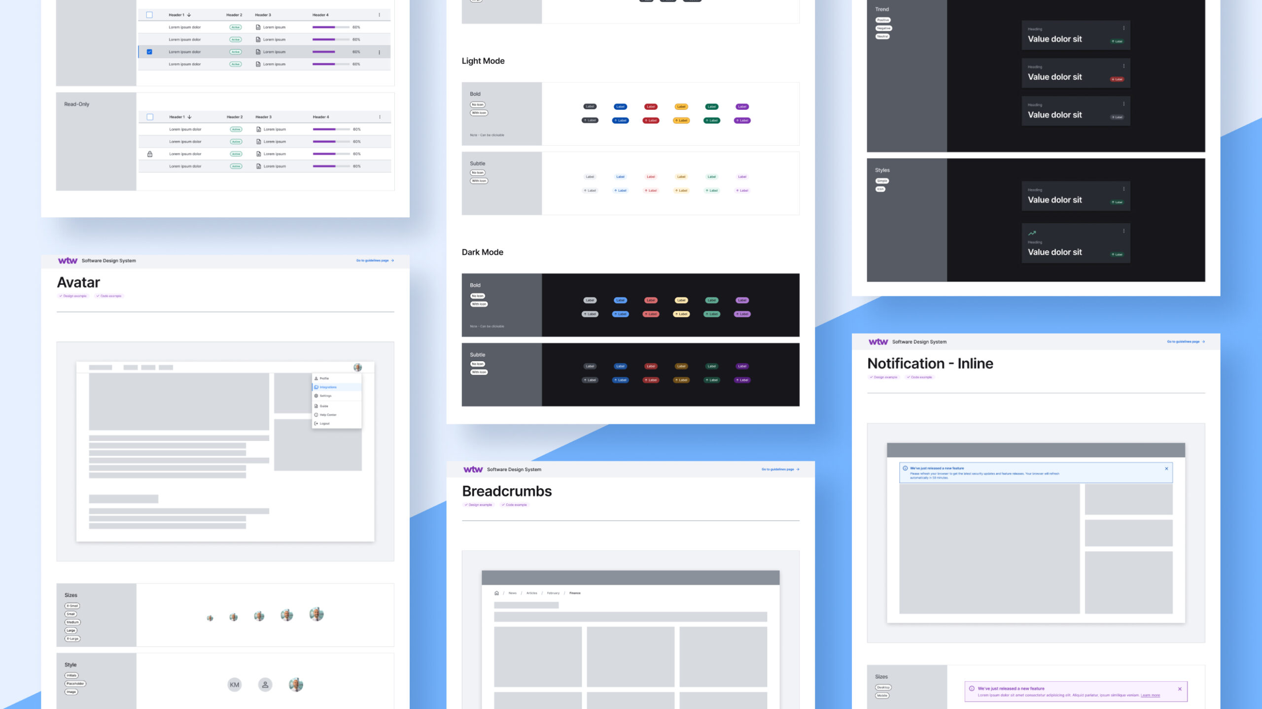
The system was designed starting with 10 foundational styles and expanded into 42 system defining components, with variants of each.
