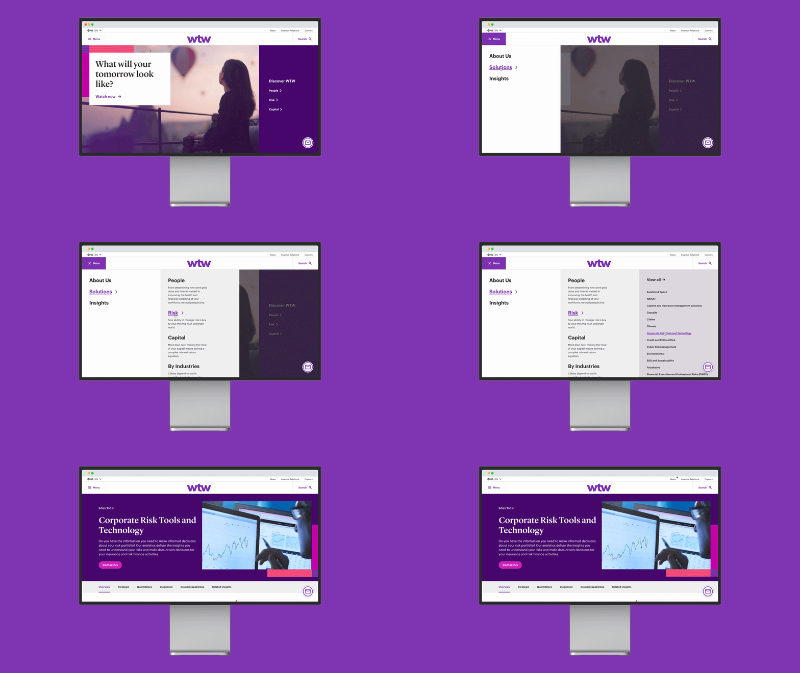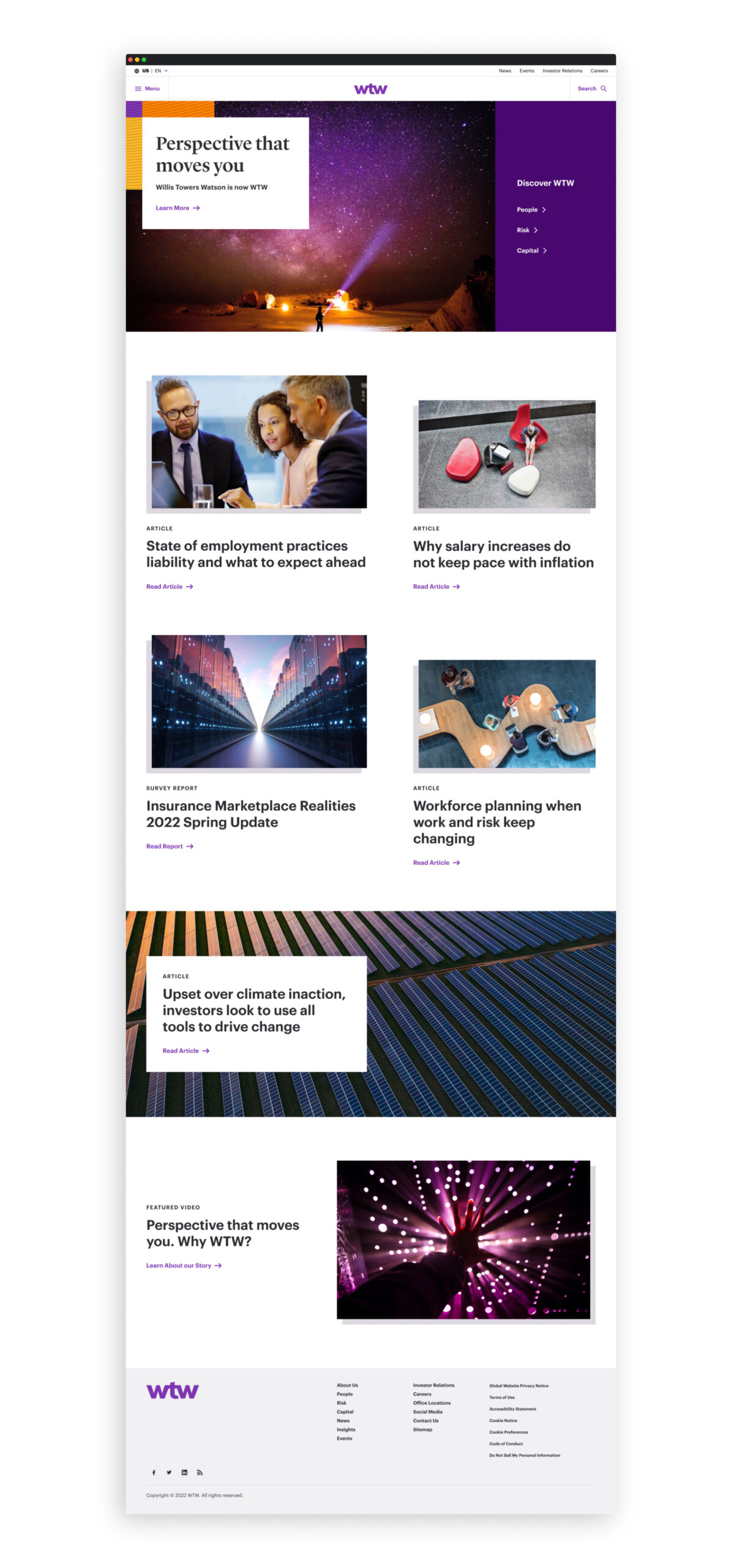
Equipped with its fresh brand identity, WTW sought a revitalization of all digital marketing touch points. The challenge at hand was to refrain from altering the existing site structure or flow. The primary objective was to understand how this newly crafted branding could seamlessly integrate and evolve within the digital landscape.
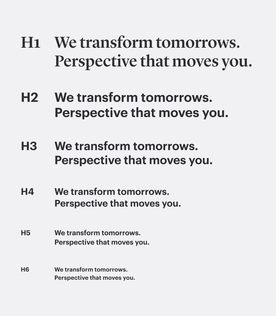
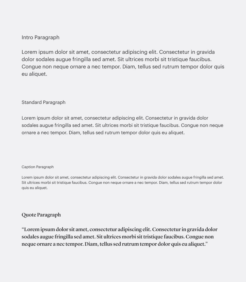
Developing a design system to complement the recently established brand guidelines proved to be the ideal solution for WTW. Through close collaboration with the client, we gained valuable insights into their specific needs, as well as a comprehensive understanding of the current functions and usage patterns within their site.
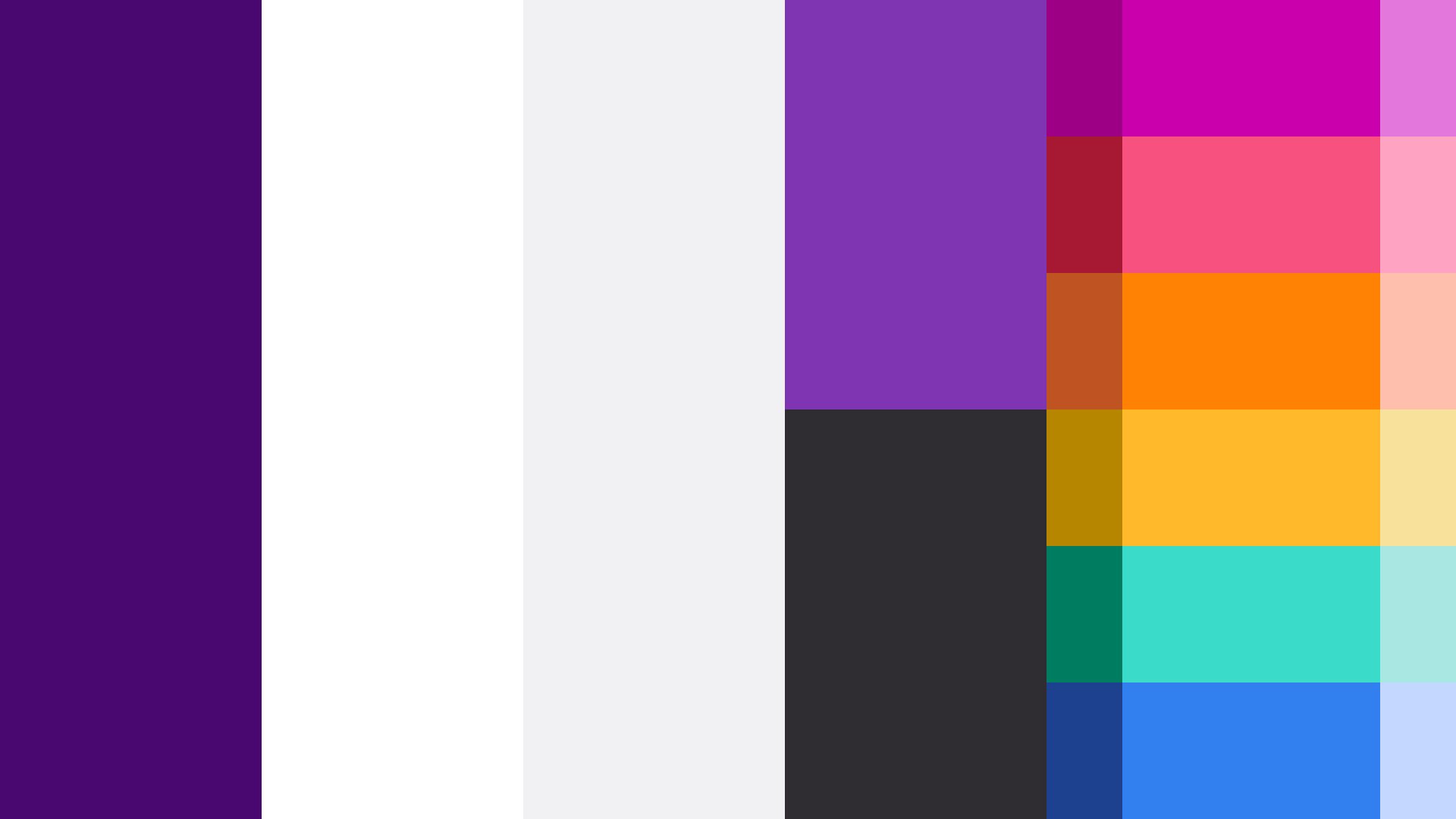
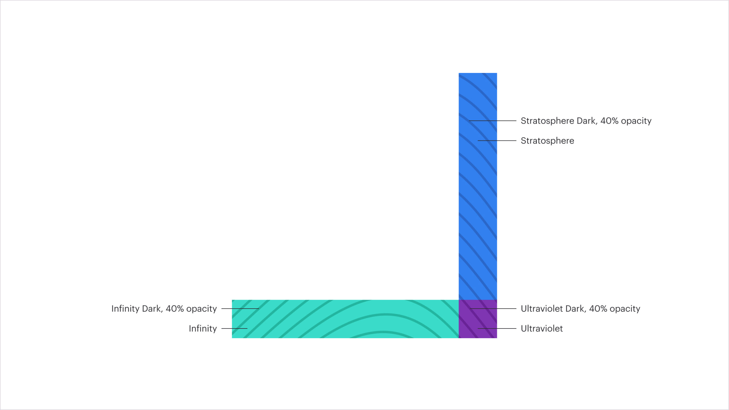
This design system effectively brought the vibrancy of the new color palette to life in a meaningful way, all while prioritizing accessibility standards and aligning with current user behaviors.
The previous site exclusively utilized the primary brand color, Ultraviolet, for all call-to-action elements in the digital interface, sparking debates over its effectiveness as a brand practice. The decision-making process became more evident as we assessed the significance of maintaining Ultraviolet as the primary CTA color versus incorporating one of the newest additions to the brand palette.
Building upon this, we successfully transformed digital assets into a cohesive system, seamlessly integrating them into the digital realm and thereby enhancing the brand's presence in the online space.
Director
Design System, Brand Implementation, System Application
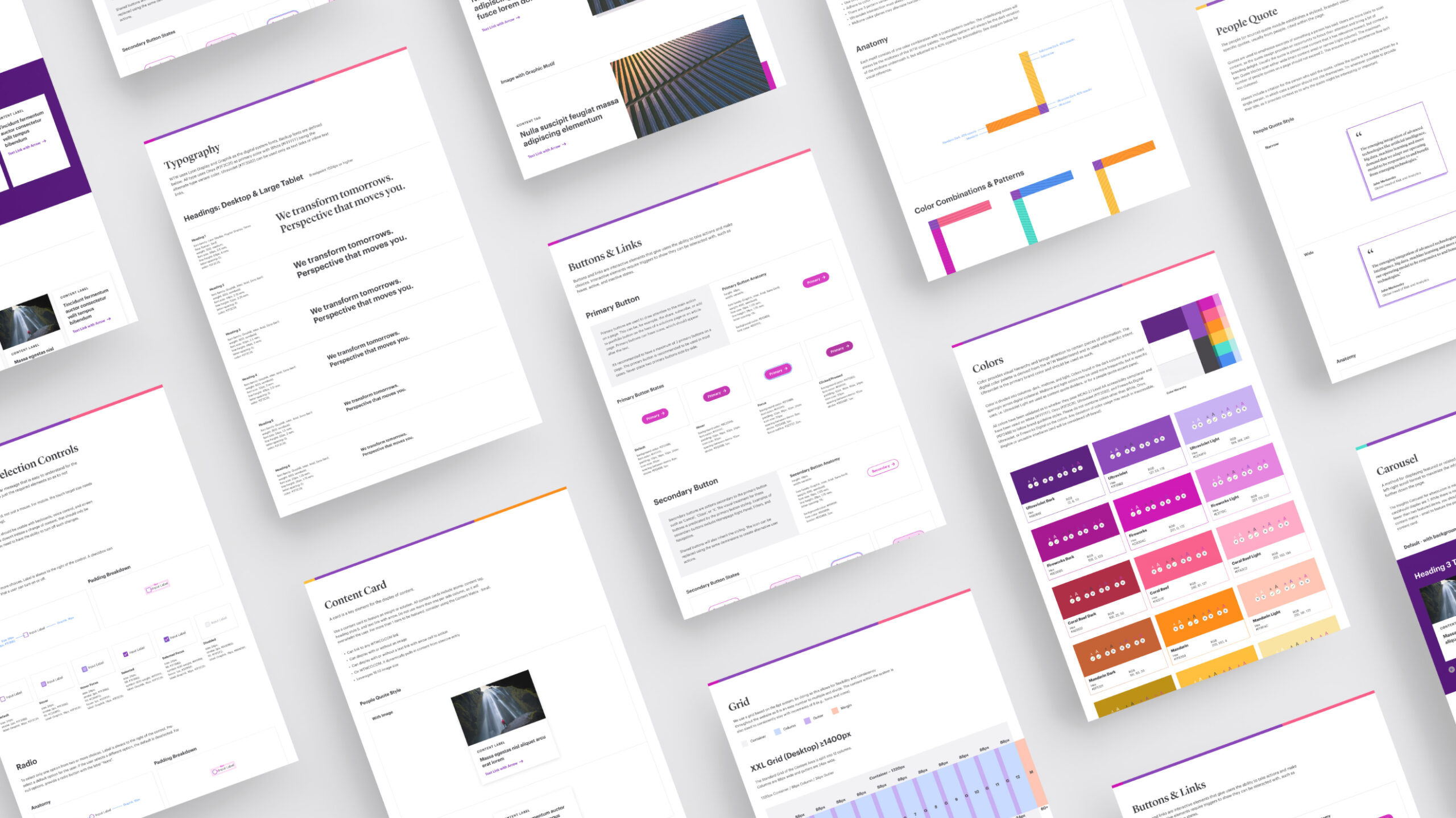
The clients desired the system to be structured according to the atomic principle, guaranteeing consistency across the design and layout of the entire site. This approach not only maintained uniformity but also facilitated the seamless transition of their existing assets to the new style during updates.

